11 thoughts on “This is Mike_C basic bitch in life.”
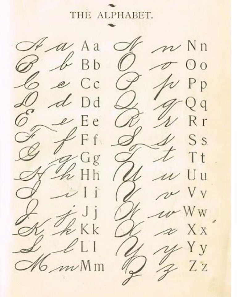
No, Kevin. No. That chart fails to capture the full idiocy of Palmer. For one thing, the capital A is “pointy” on top. The REAL Palmer capital a is just a big lower case a.
It’s the axolotl of handwriting. An axolotl is an amphibian that can breed while still in its larval stage. They need never “grow up”. (Certain “elites” are getting aroused at the thought of this. Sleipnir’s hooves, but we are ruled by sick people.)
But you did get the hideous capital I and even worse (somehow) cap G. Also, what’s with the idiotic little loop at the top of the lowercase “c”? That unnecessary flourish makes it look like lowercase “e”. For fucks sake.
General design philosophy: make it as simple (and thus elegant) as you can without taking away functionality and ease of use. If you feel the need to put lipstick and eyeliner on it, at least makes sure your additions actually enhance beauty. That there little loop is like raccoon eyeliner — makes it uglier, and ridiculous.
It’s the closet I could find in a relative time frame. My cursive style is a fancier block print, but still very readable. I learned it during my high school drafting classes.
I still can write cursive, I am from that generation that was ruler smacked on the knuckles technique.
My Mothers handwriting looked like artwork up until the day she passed.
Mine was “respectable”, until I TOO took a drafting class in high school.
For the next 30 years it was clean, blocky, and personalized and I received many compliments for it.
Now? “I” can hardly read my own scrawl!!
Old age sucks. Would not recommend.
Yeah. Cursive and I never agreed, and Mechanical Drawing in 7th grade got me off of it as soon as I could. Even then, my writing barely can be read. NOW, the Coumadin Shakes makes ANYthing I write down on paper darn near illegible.
hank god for keyboards!!
Many things got lost with the adoption of CAD drafting, and perhaps the most glaring was the personalization of hand printing mentioned by Fish. You could tell at a glance who in a drafting department had done the drawing by the personalization of the printing thereon, and the better printers were said to “have a good hand.” It was one of the hallmarks of a highly skilled draftsman, for sure one of the things employers looked at closely while evaluating job applicants, and all that is lost now.
On my mother’s side, my great grandfather’s handwriting looks like Calligraphy. He went to the 8th grade and was a mule and plow kind of guy.
My mother kept my penmanship pages from 5 yr old or so. Surprises me how nice a hand I had. Unfortunately as my mind got to working faster my hand couldn’t keep up and by 10-12 I couldn’t read my own words. Funny how things work. Now I can’t carry a thought long enough to put in print
I write in chicken scratch, and I can read it just fine.
We changed cursive writing styles 3 times in three years. At that point, I said the hell with it and did my own thing. It’s a combination of drafting lettering and cursive. I can read it, and that’s all that counts.
I too learned what was touted as Palmer Method cursive long ago. The letters I learned to write didn’t look anything like any of the letters pictured in that chart. My writing was described as elegant by some as I became an adult. Now, in old age, after decades of keyboarding and swollen hands from meds supposedly designed to keep me alive, my pen and pencil or ink writing is appallingly awful. I was looking at my grocery list at the store the other day and if it wasn’t for the fact that I wrote it so know what the words were meant to convey, it would be illegible to most.
On my mother’s side, my great grandfather’s handwriting looks like Calligraphy. He went to the 8th grade and was a mule and plow kind of guy.